Analysis of a Twitterstorm: how to make both liberals and conservatives hate you with one tweet
29 Jun 2017In this post, I explore some data I collected from a rather nasty and unexpected Twitterstorm that began with a colleague’s tweet. I’ve used twitteR to analyze data about users in the past, but this is my first time working with raw tweets. If you want to learn more about how I did this, check out the project’s well-annotated GitHub repo.
Oh, and despite the title of this post, I don’t actually provide a formula for how to make both liberals and conservatives hate you with one tweet. Twitter is a noisy place where the arbitrary whims of groupthink reign supreme, and I suspect it is extremely difficult to predict when a particular tweet will cause a Twitterstorm, particularly from a user of low to moderate popularity in the Twitterverse.
On June 11, 2017, Arizona State University professor Katie Hinde unleashed a Twitter storm with the following tweet:

The tweet was incredibly popular, garnering over 132k likes and 26K retweets over about 36 hours. However, the tweet also attracted quite a bit of negative attention and discussion, and that will be the focus of this analysis.
Twitter users may interact with a post in the following ways:
- Favorite: This simply indicates that the user likes the tweet
- Retweet: This spreads the tweet ‘as-is’ via the user’s timeline
- Quote: This is essentially a retweet with commentary added
- Reply: This tweets a reply directed @ the original tweeter
Favorites and retweets are generally positive reactions, while quotes and replies can provide more nuanced feedback. In general, quotes are primarily aimed at a users own community, while replies are primarily aimed at the original tweeter and their shared social network. My focus will be on the quotes and replies to the infamous tweet.
The data
I downloaded quotes and replies to the tweet, limiting my query to the 36 hours in between the initial tweet and this follow up blog post (which is worth reading if you find yourself feeling either offended by the tweet, or confused about why anyone would be offended). After cleaning the text data, I stored the replies and quotes in a dataframe along with some information about each tweet: time of the tweet, and the number of favorites and retweets. I also added data about the users making the tweets: user screenname, follower and friend count, geographic location, and self description. The script for compiling this data is here.
Next, I created a social network based on mutual friends for of all the users who replied to or quoted the tweet, plus Dr. Hinde herself. On Twitter, a ‘friend’ is someone you follow (they don’t have to follow back), such that people with similar interests tend to have more friends in common. This ‘co-following network’ will hopefully tell us something about the different communities that engaged with Dr. Hinde’s tweet. The script for constructing the social network is here.
Finally, the script for performing the analyses presented in this post is here.
Twitterstorm over time
The original tweet was sent around 9 pm on June 11th. There was a slow trickle of reactions and responses throughout the night, but things really started to pick up around 7 am on June 12th as people woke up and checked their Twitter feeds. The rate of replies continued to increase throughout the day, reaching its peak at ~200 replies per hour at 4 pm. After 5 pm, replies began to decline, although they remained fairly high and began to pick up again on the morning of June 13th. My dataset includes 4843 total tweets (2726 replies and 2117 quote tweets).
However, the pure volume of tweets is not the whole story, because not all tweets are equal. The vast majority of tweets are ignored by the Twitter community, while a small number are highly influential. Below is a histogram of the volume of tweets over the 36 hour period (bins represent 30 minutes), and I overlayed red lines on the histogram to show the timing of the most influential tweets in the Twitterstorm. The height of the red lines corresponds to the number of retweets divided by 10 (I did this so that they would fit on the same chart as the histogram), and I labeled the 6 most popular tweets with the screennames of their authors:
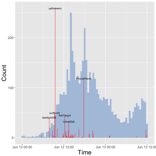
Here is the text of 6 of those most popular tweets, in order of occurance:
- @lawilson009: I hate to be the negative Nancy in all this but this is just making more work for the employees there. Trust me retail is annoying as it is.
- @surfbordt: when you make a retail worker’s life harder
- @upthetwerx: White feminism is thinking you made a difference rearranging merch in one retail store and creating more work for minimum wage workers.
- @AskTarget: We aim to offer great selection & variety for every guest, & our tees are no exception. Check girls’ selection here: tgt.biz/9l4t
- @LiteralSalt: Imagine being the person that stocked those tank tops then having to watch an obnoxious customer create more work for you. You’re a knob.
- @PrisonPlanet: Did you just do something pointless & dumb to virtue signal and gain social brownie points from other idiots? Yes. Yes you did.
Clearly, the most influential tweets in this Twitterstorm were negative reactions (although Target keeps its tone pretty neutral while defending itself). In the next section, I take a closer look at the content of the tweets by using sentiment analysis to explore the emotional content of the tweets and wordclouds to visualize the most commonly used words in the Twitterstorm.
Sentiment analysis and word clouds
I performed sentiment analysis to classify tweets according to their emotional valence or tone. I used two different algorithms to classify tweets according to their emotional content:
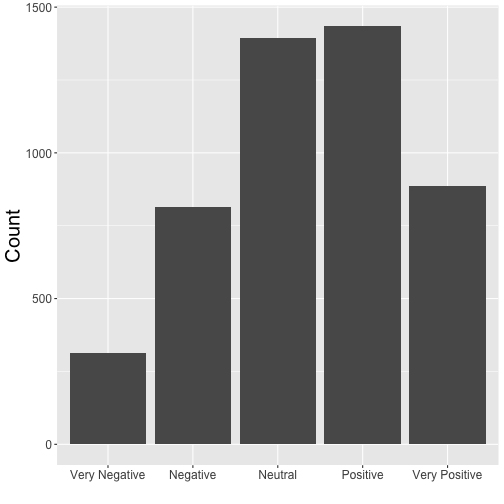
1) Emotional valence: a five point scale that classifies each tweet as Very Negative, Negative, Neutral, Positive, or Very Positive. The method does not produce any missing values, since tweets that don’t carry much emotional content get labeled ‘Neutral’.
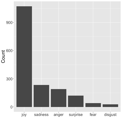
2) Emotional tone: a six category system that uses a naive Bayes classifier to characterize tweets as Joyful, Angry, Sad, Surprised, Fearful, or Disgusted. This method produces missing values when a tweet does not provide enough emotional content to be labeled. Just 36% of the the tweets in this dataset could be classified.
Below are the distributions of the different sentiments in the Twitterstorm:
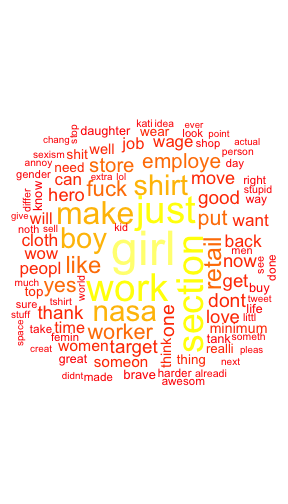
To get a sense of the exact language people used, we can vizualize the frequency of words with a wordcloud. Wordclouds are a visually appealing way to get a snapshot of the content of a corpus, but their creation and interpretation is more art than science (see here for an impassioned diatribe against wordclouds). However, despite their shortcomings, wordclouds can be a useful way to get a ‘feel’ for a text-based dataset and check for errors. A good example actually came from this project. After my first round of cleaning the text and making a wordcloud, I was confused about why so many people were using the word ‘amp’. Is that what kids are saying these days?? What does it mean?? I asked Dr. Hinde, and she said nope- that’s probably not right. Sure enough, I looked a bit closer and discovered that ampersands in tweets are represented by ‘&’, which reduces to ‘amp’ after punctuation is removed. So maybe wordclouds aren’t the most scientific thing in the world, but they are pretty to look at and they have their utility. That said, here is a wordcloud for all the tweets:
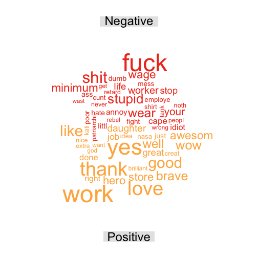
Alternatively, we can use a comparison cloud to look at the frequency of different words across some grouping factor- for instance, the emotional valence or tone of the replies. In this wordcloud, the angular position and color of words reflects the emotional category they come from. Here is the comparison cloud for emotional valence (I grouped the positive and negative categories together and eliminated neutral tweets for this wordcloud):
Here is a comparison cloud for the emotional tone of the tweets:
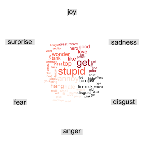
These wordclouds seem reasonable, but a big concern for this dataset is that the emotional classifiers are not good at picking up on sarcasm, and these tweets have a lot of sarcasm. I suspect that many of the ‘positive’ and ‘joyful’ replies are in fact sarcastic (you can inspect the raw data if you doubt me).
In the next section, I take a look at the social network of users in the Twitterstorm. Which different subgroups on Twitter interacted with this tweet? When and how did they do it?
Social network analysis
I obtained a list of the friends of each Twitter user that replied to or quoted the original Tweet, and I counted the number of common friends for each pair of users. These ‘mutual friend’ counts represent the weight of edges connecting users in the network. To make the network more tractable, I excluded 8% of users that had over 2000 friends.
I used a greedy algorithm to identify clusters of users. The algorithm identified 3 major clusters, which together comprised 99.7% of the network. I dropped the remaining 0.3% of nodes from the network. To get a sense of what these different social network clusters represent, let’s view the top 25 most popular friends from each cluster:
      Cluster 1         Cluster 2         Cluster 3
   1  "tylerthecreator" "realDonaldTrump" "BarackObama"
   2  "LILBTHEBASEDGOD" "POTUS"           "POTUS44"
   3  "BarackObama"     "PrisonPlanet"    "HillaryClinton"
   4  "Drake"           "wikileaks"       "neiltyson"
   5  "POTUS44"         "Lauren_Southern" "MichelleObama"
   6  "chancetherapper" "RealJamesWoods"  "jk_rowling"
   7  "VancityReynolds" "benshapiro"      "StephenAtHome"
   8  "wizkhalifa"      "AnnCoulter"      "SenSanders"
   9  "kendricklamar"   "TuckerCarlson"   "NASA"
   10 "SportsCenter"    "scrowder"        "NotAltWorld"
   11 "dril"            "Sargon_of_Akkad" "SenWarren"
   12 "colesprouse"     "SheriffClarke"   "nytimes"
   13 "POTUS"           "CHSommers"       "ACLU"
   14 "FilthyFrank"     "MsBlaireWhite"   "GeorgeTakei"
   15 "realDonaldTrump" "Cernovich"       "maddow"
   16 "PlayStation"     "JamesOKeefeIII"  "BernieSanders"
   17 "GordonRamsay"    "GodfreyElfwick"  "TheEllenShow"
   18 "trvisXX"         "TRobinsonNewEra" "iamjohnoliver"
   19 "JColeNC"         "Gavin_McInnes"   "ActuallyNPH"
   20 "MacMiller"       "StefanMolyneux"  "TheOnion"
   21 "KidCudi"         "Nigel_Farage"    "BillNye"
   22 "dylansprouse"    "BreitbartNews"   "BBCBreaking"
   23 "premierleague"   "seanhannity"     "FLOTUS44"
   24 "GaryLineker"     "DonaldJTrumpJr"  "AP"
   25 "earlxsweat"      "RubinReport"     "elizabethforma"
The second and third clusters seem to represent the political right and the political left, respectively. The first cluster is a bit more difficult to characterize- the only political figures that made their top 25 are Donald Trump and Barack Obama, and otherwise they seem to be more interested in popular culture: music, sports, video games, and television. I will henceforth refer to the first group as ‘Apolitical’, the second group as ‘Rightwing’, and the third group as ‘Leftwing’. Let’s visualize the network with nodes colored according to their cluster- gray for Apolitical, red for Rightwing, and blue for Leftwing:
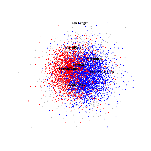
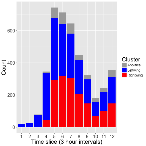
This gives a nice overview of the static network structure among users who interacted with Dr. Hinde’s tweet, but it is also helpful to watch the network evolve over time. The following animation shows the growth of the network over 3-hour intervals, highlighting users that posted the most influential tweets. The entire animation covers a 36 hour period:

Now that we have assigned Twitter users to social network clusters based on their common friends, we can repeat some of our earlier analyses of the tweets, but this time focusing on comparisons across the Apolitical, Rightwing, and Leftwing clusters. Here is a breakdown of tweets coming from each cluster over time:
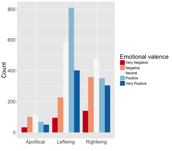
Here is a comparison of the emotional valence of tweets from each cluster:
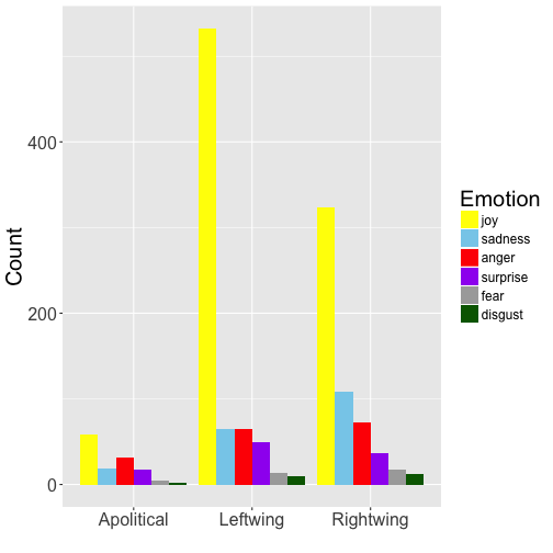
And here is the emotional tone of tweets from each cluster:
And finally, here is a wordcloud comparing the clusters:
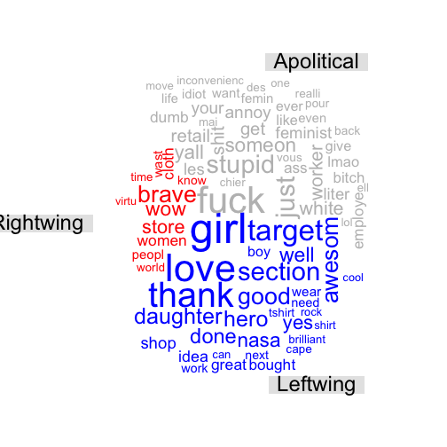
The apolitical cluster is full of dicks! They monopolized the words ‘fuck’, ‘shit’, ‘ass’, ‘bitch’, ‘stupid’, ‘dumb’, ‘idiot’, and ‘lmao’. Meanwhile, the most notable thing the rightwingers monopolized was sarcastic use of the word ‘brave’. The leftwingers used more positive words, although I will reiterate that sarcasm is prevalent in these tweets, so I wouldn’t read too much into that.
Concluding remarks
From the perspective of an R analyst just getting started with Twitter, these were my major takeaways from this project:
- The Twitter API’s rate limiting features are the biggest challenge to harvesting data from Twitter, as they force you to think about your scripts running too fast. The
Sys.sleepfunction is useful for preventing your requests from hitting those limits. - Word clouds are useful for catching text cleaning errors
- Sarcasm thwarts sentiment analysis
- Co-following networks are an effective way to find meaningful clusters of Twitter users based on common interests
And for the record, from the perspective of a feminist female scientist, this is how I feel about the entire ordeal:

‘nuff said.
Footnotes
The following R packages/software were used for this project:
twitteRfor harvesting raw Twitter dataRStem,sentiment, andRSentimentfor sentiment analysistopicmodelsfor a very boring ‘topic analysis’ I did not present in this posttmandwordcloudfor wordcloudsigraphfor network analysis and static visualizationanimationand ImageMagick for the network animationggplot2for barcharts and histogramsplyrfor various data manupilations
The following blog posts/tutorials were very helpful:
Thanks to Sam Fox for pointing out that emotions have colors, and my initial arbitrary choice of colors was creating a Stroop effect.
Thanks to Katie Hinde, India Schneider-Crease, and Joseph Feldblum for the use of their Twitter accounts to compile the data.
Code is on GitHub.
Data is on figshare.
